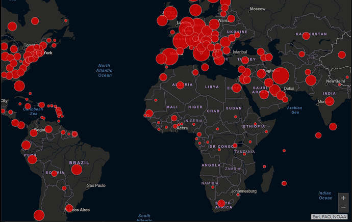
Coronavirus - Live Interactive Dashboard - Global and Country Specific

An interactive live dashboard has been developed by John Hopkins University.

Project Collaborators

This work is being led by Lauren Gardner at Johns Hopkins University CSSE, in collaboration with Aleksa Zlojutro and David Rey at rCITI at UNSW Sydney, and Ensheng Dong at JHU CSSE. At JHU, we have previously developed an interactive dashboard mapping the outbreak in real-time, and a written a blog.

https://gisanddata.maps.arcgis.com/apps/opsdashboard/index.html#/bda7594740fd40299423467b48e9ecf6
1 Like
1 Like

Public Health England officially released the UK only dashboard.
@Indians_in_UK

https://coronavirus.data.gov.uk

https://www.arcgis.com/apps/opsdashboard/index.html#/f94c3c90da5b4e9f9a0b19484dd4bb14

India’s very own Covid19 situation dashboard.
Check the facts here:
http://covidout.in/

1 Like

Singapore Regional Report

South Africa:

BBC’s visual on the spread of the disease from day 1 till 19/03/2020

https://public.flourish.studio/visualisation/1539110/embed?auto=1

Germany
https://www.coronazaehler.de/